ShopDreamUp AI ArtDreamUp
Deviation Actions


Description
My work may not be used in any ways (even for practice), edited, copied, printed, sold, published, uploaded or reproduced on other sites without my express written permission.
Thanks to the contributor (Smile)") :
:
*Free-Stock-By-Wayne : free-stock-by-wayne.deviantart…
*wolverine041269 : wolverine041269.deviantart.com…
~Alegion-stock : alegion-stock.deviantart.com/
=Lileya : lileya.deviantart.com/
*CHEYENNE75 : cheyenne75.deviantart.com/
My others works :


Thanks to the contributor
*Free-Stock-By-Wayne : free-stock-by-wayne.deviantart…
*wolverine041269 : wolverine041269.deviantart.com…
~Alegion-stock : alegion-stock.deviantart.com/
=Lileya : lileya.deviantart.com/
*CHEYENNE75 : cheyenne75.deviantart.com/
My others works :
Image size
1247x1680px 1.37 MB
© 2013 - 2024 MelodyPictures
Comments25
Join the community to add your comment. Already a deviant? Log In
First let me start off with how much I LOVE THIS PIECE! It is very attractive and very well composed. I believe you did a superb job on this. Now lets get on with this shall we?
[Things I like]:
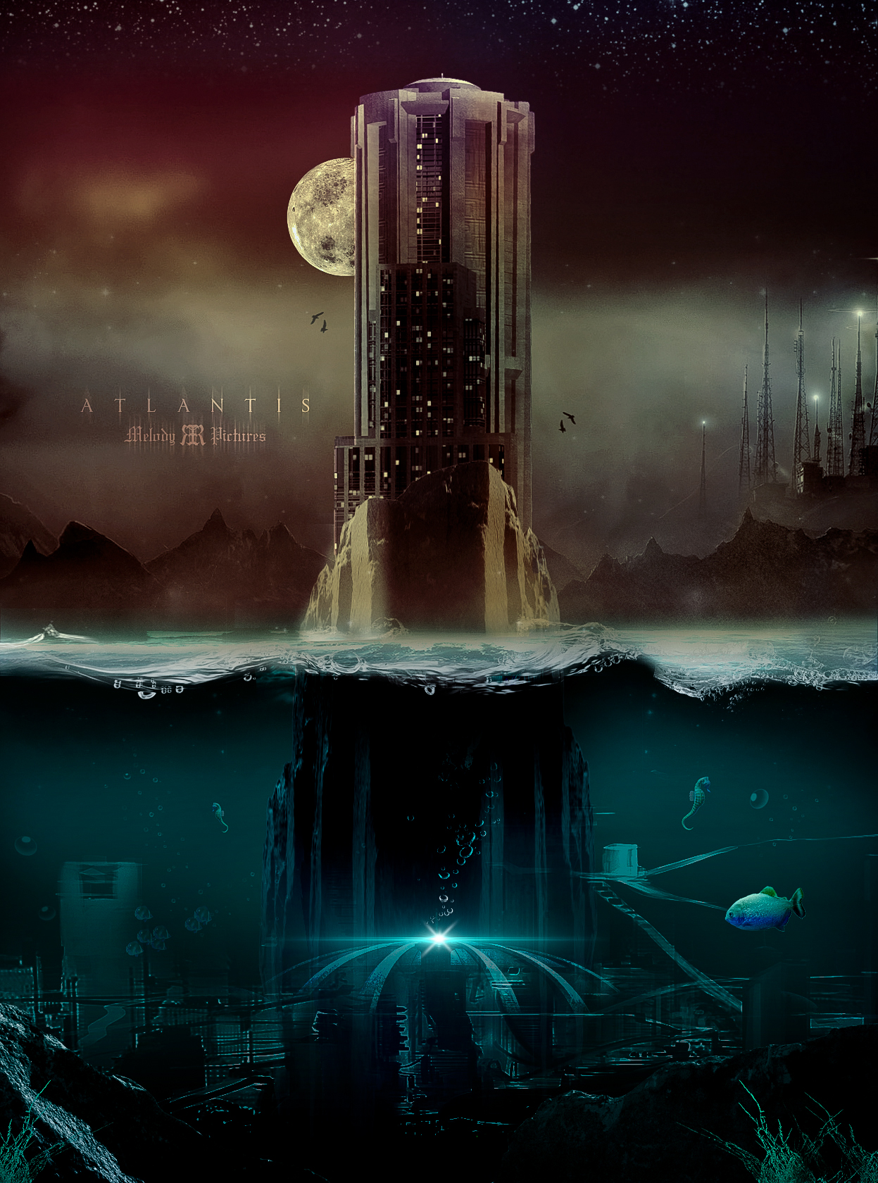
I believe this is well composed. You have all the elements of the design in nicely placed areas, which gives me a a happy feeling in my tummy.
I love the contrasting colors you used with the warms are the top and the cools at the bottom (obviously going from land to sea). The starry top is a unique touch as it goes from starry, to atmospheric, to normal day to day sky and down the the ground. You did great with the water surface and transition from land to see, I believe it looks well done and blends nicely. I love how you made the centerpiece/focal an island, nice touch. The clarity of this piece is awesome and I could stare at it all day. Well done on the text style too.
[Things to adjust]:
Okay, now onto the things I think could use a little tweaking (respectfully of course)
I see how you have the main focal (building/island), you have the mountains behind it, and you also have some facroty or building structure behind THAT... I see them all on almost the same level of sharpness. Same with the sea section (no jokes intended); I see the foreground with the grass and rock, I see the midsection with the fences and light, and I see the background with the seahorses, again all with the same sharpness.
Your shadowing and lighting is perfect, and it helps the depth greatly, but I just think it's a little unusual that they'd all be just as sharp as each other although they are on different fields. Maybe adjusting that will bring this piece to even better depths (hehe).
All in all GREAT PIECE ! I LOVE THIS! Hope to see more and I hope you thought this was a fair critique <img src="e.deviantart.net/emoticons/s/s…" width="15" height="15" alt="